
First impressions happen in under three seconds. That pressure never fades for designers — especially when a client waits to see their brand on a 3.5 × 2 inch card. The business card mockup has grown from a presentation shortcut into a craft of its own. In 2026, aesthetics are sharper and the trends are moving fast.
The Trends Reshaping Presentation
1. Tactile Texture Rendering. Photorealistic cotton grain, soft-touch laminate, and linen finishes are now baseline expectations. Flat renders are out.
2. Cinematic Lighting. Dark marble, long shadows, golden-hour raking light — editorial photography’s visual language applied to card presentations.
3. Minimalist Negative Space. Single-card layouts on clean neutral grounds dominate client decks. Less clutter, more brand.
4. Stacked and Fanned Arrangements. These convey volume and confidence — the quiet message that this brand prints in quantities.
5. Mixed Material Environments. Cards alongside leather notebooks or dried botanicals create lifestyle context isolated product shots can’t match.
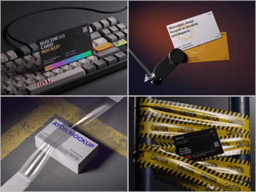
6. Overhead Flat Lays. The bird’s-eye view refuses to retire. Social-media-ready, versatile, and designers have complete compositional control.
7. Multi-Angle Bundle Sets. Front, back, angled, stacked, close-up — all in one download. Multiple perspectives eliminate revision cycles.
8. Built-In Color Style Variations. One scene, multiple moods. Light, dark, warm, or cool — the same card shifts tone without switching files.
9. Specialty Finish Mockups. Foil, spot UV, edge-painting, transparent PVC — premium finishes are back, and clients expect photorealistic previews before print.
10. Earthy, Sustainable Palettes. Kraft textures and muted organic tones resonate as brands embrace sustainability.
Real Examples: Business Card Mockups in Practice
Trends live in theory. Here’s where they show up in actual design work.
Rebranding a law firm. A studio tasked with modernizing a regional law firm’s identity used a dark-surface mockup — deep slate background, single card, dramatic side lighting — to shift the client’s perception before a single color was approved. The visual immediately communicated “serious, premium, contemporary.” The old team had been leaning toward beige. After seeing the mockup, they didn’t.
Launching a specialty coffee brand. A freelance designer presented three identity directions simultaneously, each using the same card design dropped into different mockup environments: one on raw oak with coffee beans, one on a clean white surface with soft morning light, one flat lay with kraft paper and twine. Same logo, completely different brand stories. The client picked a direction in one meeting instead of three.
Pitching a luxury skincare line. An agency used a multi-angle mockup bundle to walk stakeholders through every touchpoint — front face, back detail, the card held between fingers, a stack fanned on marble. Each view answered a different question: Is the logo legible? Does the edge-paint finish read well? Does it feel premium in hand? The photorealistic renders made those questions answerable without a single print proof.
Building a freelance portfolio. A junior designer with modest client work used well-chosen mockups to elevate three small business projects into compelling case studies. The same card that looked ordinary as a flat file looked intentional and polished presented on a textured linen surface with correct shadow depth. Two new clients cited the portfolio specifically when reaching out.
Presenting to a remote client across time zones. No in-person meeting, no printed samples to mail. A designer exported four mockup views as a single PDF and sent it the night before the call. The client arrived prepared, had specific feedback, and the revision round was the last one. The mockup did the prep work.
These scenarios play out daily in studios and solo practices alike. The business card mockup isn’t window dressing — it’s how decisions actually get made.
Why ls.graphics Stands Out for Premium Mockups
Not all mockups are equal. You know the frustration: promising previews that open to flat lighting, messy layers, and hasty compositions.
ls.graphics is a different experience. Their business card mockup collections are built to a genuinely premium standard — visible the moment you open a file. Rendering is exceptional: shadows, reflections, and textures crafted photorealistically and built to hold up at 300% zoom. Layers are clearly named and organized, making smart-object placement a 60-second task.
The range covers every context: front-facing, angled, stacked, flat lay, and close-up detail in cohesive multi-angle sets. Color variations shift a scene from bright and airy to moody and editorial without switching files.
ls.graphics excels at restraint. Compositions are minimalistic — clean surfaces, purposeful props, nothing competing with the card. The design breathes, making their work equally suited for luxury brands and independent studios.
Conclusion
The business card mockup is no longer a finishing touch — it’s a strategic asset that wins clients, justifies premium print, and elevates brand identities from good to genuinely memorable. The 10 trends of 2026 converge on the same idea: realism, flexibility, and intentional design.
For designers who need that quality without rebuilding scenes from scratch, ls.graphics has earned its reputation. Once you’ve worked with their files, it’s clear why.